


Project description
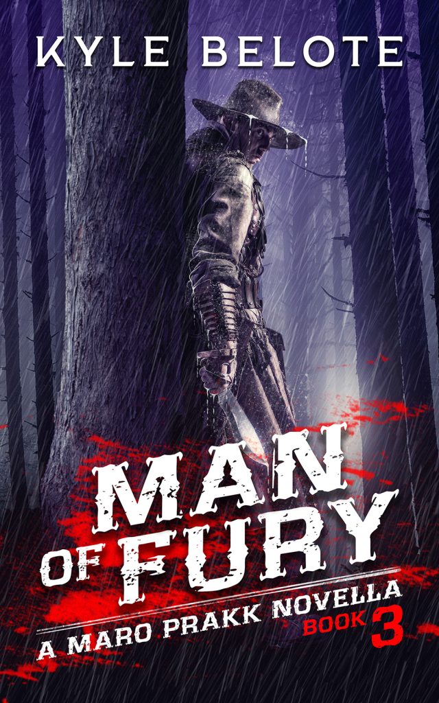
Western fantasy cover design establishes an immediate sense of danger through a lone figure hiding behind a tree in a rain soaked forest. The character grips a knife while partially concealed by darkness and shadow. Heavy rainfall cuts diagonally across the composition, creating movement and tension throughout the scene. Meanwhile, vivid red blood textures beneath the typography intensify the brutal atmosphere. The visual direction blends western grit with dark fantasy menace, creating a cover that feels cold, violent, and predatory from the first glance.
The composition relies on negative space and restricted visibility to build suspense. The hidden figure becomes the focal point because the surrounding forest fades into darkness and mist. At the same time, the strong white typography contrasts sharply against the deep purple and black palette, ensuring readability at thumbnail size. The angled subtitle treatment adds momentum and aggression, which supports the novella’s action driven tone. As a result, the cover communicates intensity and survival without overcrowding the layout.
From a commercial perspective, the project aligns closely with modern grimdark fantasy and western inspired action fiction. The cinematic rain effects and hunter imagery position the story within darker fantasy subgenres while maintaining a unique frontier identity. In addition, the recurring visual language supports continuity across the Maro Prakk series, strengthening long term author branding. Therefore, the design helps the book stand out in competitive digital marketplaces where atmosphere and immediate genre clarity strongly influence reader engagement.

